It's time for a new CAS-ual Fridays challenge! This week's challenge is to use color blocking. I cruised around Pinterest looking for inspiration, and I ran across this pin:

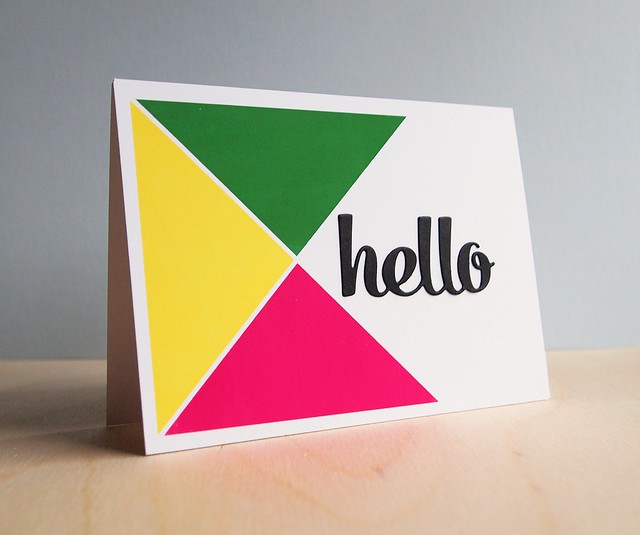
I love the color combination (and I would pretty much kill for those pants!). From watching way too much Project Runway, I don't think color blocking has to actually involve blocks, so I went with triangles on my super graphic card:
It's hard to tell from this photo, but the color-blocking is one-layer. I used AUDacious Designs' Quarters template for the three triangles. I stamped on them with a digital brush to add a subtle texture (and I know, there's really no texture, ha ha). I color matched the boxes using the photo. If you want to see how I did it, I have a video tutorial (see my Digital Tutorials above).
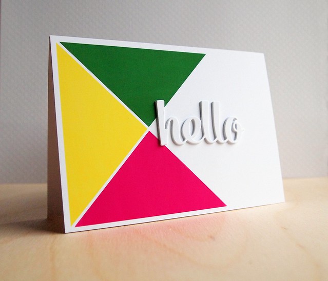
I die-cut the "hello" from Paper Smooches' Quote Tag Dies in black. I wasn't sure about the black, so I made another card and die-cut 4 layers of white cardstock. I got the inspiration from JJ's Paper Smooches card (although mine's not as thick or cool):
I'm not sure which I like better. Which do you like better?
If you'd like to do some color-blocking of your own, you can link up to this week's CAS-ual Fridays challenge. The winner will receive some CAS-ual Friday Stamps:
You can link up your projects HERE.
Thanks for stopping by! Have a wonderful weekend!
Supplies
Cardstock: (True Black) PTI
Other paper: (Premium White Photo Paper) Office Max
Digital template: (Quarters) AUDacious Designs at Pixels and Company
Die: (Quote Tag Dies) Paper Smooches


.jpg)
Love this fabulous bold color blocking! I kinda love the second one with the white sentiment and how it ties into the design....but they are both fab!
ReplyDeleteHmm....they're both pretty cool designs. Love the vibrancy of the color blocking. Since I saw the black sentiment first that would be my pick! Have a happy Friday!
ReplyDeleteLoveeeeeee this! LOVING those colors and the triangles!!!!!!
ReplyDeleteWow.! This pops!! I like the white lettering better.
ReplyDeleteooooohhhh.....love seeing how you were inspired. I love them both.
ReplyDeleteSo bold and modern, just perfect!
ReplyDeleteThis is so impressive :) love the bold colors
ReplyDeleteLOVE these. Great bold colors!
ReplyDeleteThese are AWESOME I love the white sentiment! I loved it with the black, but it got even better with the white! Awesome!
ReplyDeleteI saw your card at CAS-ual Fridays but loved it so much that commenting on the group post wouldn't suffice...so here I am. :) I love it! And what a treat to see your second card. I'm trying really hard to pick a favorite...but I just can't. I like them both.
ReplyDeleteBoth are fabulous, I couldn't pick one! TFS
ReplyDeleteWOW!!! I really love the 1st card!! But the 2nd one is awesome too! Guess I like that bold black sentiment...really catches my eye!! Stacking the fonts like the white one must be time-consuming but I like the look! I remember seeing it in the rainbow colors...very eye-catching! Thanks for sharing!
ReplyDeleteLove these graphic, colour-blocked cards! It's the black one for me -- I really like the extra contrast of the black with the triangles and white card base.
ReplyDeleteWOW ...what a stunning card Jocelyn!... hugs...x
ReplyDeleteOne of my favorite cards! Love the bold bright colors and very cool graphic design!
ReplyDeleteThese ... right there... OUTSTANDING!
ReplyDeletesuper cool cards...love the graphic look of them...
ReplyDeleteHot dang! I kinda want wall size editions of these cards. I adore both cards, but the one with the black sentiment really grabs my attention.
ReplyDeleteLove them both!! - Would it be rude to suggest the chipboard hello in black? I love the black but the depth of the chipboard really pops!! : )
ReplyDeleteCongrats on your "shout-out" from Moxie Fab!! : )