
Jocelyn Olson <--You're here
I am so incredibly excited and humbled to be among these talented ladies!

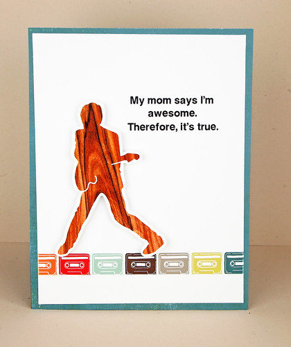
We're each covering a design principle from the new Card Design Handbook, and my principle is LINE. We're showing how using the principle enhances a card. So, here is my "good" card that doesn't incorporate line:
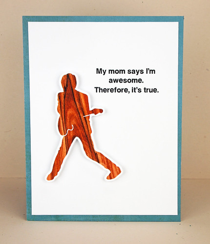
I picked the principle of line because it's probably the principle I violate the most (i.e., I often don't ground my people/objects when I make graphic cards). Yes, I'm a crafting rebel. It made such a difference to use a line to ground the guitar player:
If you don't have the Card Design Handbook yet, I can't say enough good things about it. The issue is packed with fab projects and great design tips...it's like the coolest textbook ever.
You can win a copy of the Card Design Handbook by commenting on each of the designers' blogs. To enter, please leave a comment on this post (through August 28th) for a chance to win.
Next on the hop is the incredible Angeline. Be sure to hop all the way to the Paper Crafts' blog--I hear there are some terrific prizes!
Thanks for looking!
Supplies
Cardstock: (turquoise) Bazzill
Other Paper: (premium matte photo paper) Office Max
Patterned Paper: (from It's a Boy's Life) Echo Park
Digital elements: (guitar player, cassette tapes from Boyfriend Candy Candy) Cosmo Cricket
Font: (MGOpen Moderna)
Great card!! I agree that your grounded card looks much better. Thanks for the chance to win. Hugs, Joan
ReplyDeleteYes, grounding him looks better.
ReplyDeleteGreat card! Grounding did work better.
ReplyDeleteOK weird I like both cards equally and yet there's something about the first one that says, "this needs something". I would never have been able to put my finger on it without your discussion of line.
ReplyDeleteThanks for your tips on grounding.
ReplyDeleteSoooooooooooo in love with these!!! That sentiment is the BEST and loving the wood grain!!!!
ReplyDeleteI absolutely adore those cassette tapes! this rocker is great in the wood grain! :)
ReplyDeleteGreat card! It's much better with the line! Thanks for sharing that design principle!! :)
ReplyDeleteHere you are, lol! What'd I say?
ReplyDeleteLove your card and the design principles behind it:) You're the best!
SUPER CARD!!!!!!!!!!!!! LOVE the little cassettes! :)
ReplyDeleteI like the colors. Thanks for the opportunity to win a copy of the Card Design Handbook.
ReplyDeleteAwesome card for a teenager!! Thanks for the chance to win!!
ReplyDeleteYep - grounding makes a big difference, and I LOVE what you grounded him with! SO cute!!!
ReplyDeletehousesbuiltofcards@gmail.com
www.housesbuiltofcards.blogspot.com
You should totally continue to be a rebel, because you're awesome, therefore it's true!
ReplyDeleteFab card! I always remember the grounding part when it's too late, definitely something I need to work on!
ReplyDeleteLove all your cards and this card is really cool. Thanks for the tips and advice on grounding!!!
ReplyDeleteGorgeous Card Jocelyn...Thanks for the tips !!! You are awesome...
ReplyDeleteSuper cute card! I love the sentiment!
ReplyDeleteGreat card. Thanks for the tip.
ReplyDeleteWonderful lesson thanks for sharing with us.
ReplyDeletecute card! love the cassette tapes:)
ReplyDeleteWow the "line" really does make a difference, thanks for sharing this tip.
ReplyDeleteThe line really adds emphasis! Sweet!
ReplyDeleteI am enjoying the blog hop and thank for the tip! I love your card!
ReplyDeleteThe grounding strip helped this card immensely!!! I love it!! I so want this issue for all of the tips & inspiration!!
ReplyDeleteGreat, fun card! I love the sentiment, being a mom. :p
ReplyDeleteGreat card! Thanks for the tip!
ReplyDeleteWhat a difference grounding makes!
ReplyDeleteLove learning about the different elements to card design. This is a new one to me. Thanks for the great example.
ReplyDeleteyou really improved the card with the grounding stamping of the tapes.
ReplyDeleteMe, too. I often have floating images. It is important to have line, but I think the right line is hard to do as well as you have done it here. Stamp sets would be much more effective if they had "line items." Thank you for a great lesson.
ReplyDeleteFANTABULOUS CARD!!! love the woodgrain rocker and cassette border! You rocked this principle!
ReplyDeleteAmazing how this addition adds balance to the design.
ReplyDeleteAmazing what a difference a simple line makes, but you're right, the second one looks much better.
ReplyDeleteI love the line you have used & the color it brought into the card. It not only added needed color but it cheered the card up.
ReplyDeleteOh I just love this phrase. I must send a card to my son who is a Freshman in college. Thank you for sharing this.
ReplyDeleteNow the guitarist isn't floating! Much better!
ReplyDeleteYup, grounding helped! And choosing a line of music related border? Genius touch. Thanks for the inspiration!
ReplyDeleteHow cool having the casettes for the line. Thanks for the great tip.
ReplyDeleteI think I must have trouble with the concept of grounding, too, as I thought the first card was fine -- until I saw the second one. Thanks for the lesson.
ReplyDeleteSweet card Jocelyn! I LOVE that sentiment :) Definitely love the second card better - amazing what a little line can do!
ReplyDeleteI violate this tip of grounding the elements on my cards sometimes. I try to always remember to do this but sometimes I forget!
ReplyDeleteInteresting. I never thought about it much, but it does make it nicer.
ReplyDeleteif Mom says it---it must be true!
ReplyDeleteDefinitely see the difference...thanks for the tip!
ReplyDeleteGrounding the guitar player made a big difference. Your explaination is well illustrated.
ReplyDeleteGrounding the main image makes a big difference! Now I know.
ReplyDeleteWhat a difference the grounding made in the card. This is something I will remember when making my own creations. Thanks for sharing.
ReplyDeleteThat sentiment cracks me up!!
ReplyDeleteHmmm... so you have to add a line to ground your focal point? I have to give that a try. Nice cards.
ReplyDeleteWow, I can really see the difference. The second card has the "wow factor". It does really help to ground your elements. Thanks for the lesson.
ReplyDeleteI do the same, forget about lines too.
ReplyDeleteI am the same way, I most often don't ground my images either =) Thanks for sharing your cards!
ReplyDeleteVery good example. Thanks.
ReplyDeletei really like the fun way you used lines on your card, very creative!
ReplyDeleteKristan
sierrababy08 at hotmail dot com
The grounding does make a huge difference--thanks for showing us!
ReplyDeleteLove a card geared toward older kids! (clayandamy@sbcglobal.net)
ReplyDeleteI really like both cards, but I guess I can see how the second one is a better design. I think I really need a copy of this Card Design Handbook to help me learn better techniques. Thanks for the chance to win!
ReplyDeleteI totally understand your illustration about line and see how well the cassette tapes ground that image. Great sentiment!
ReplyDeleteGives a whole new meaning to "you're grounded"! Who knew??!! Thanks for a chance to win this issue!
ReplyDeleteYes, that line to ground the image does really help!! I try and remember it, but don't always :-P thanks for the reminder!!
ReplyDeleteThe grounding makes a big difference. He's not just floating any more! Great tip!
ReplyDeleteI can see how grounding objects really helps. Love your card!
ReplyDeleteI never would have guessed what a difference that makes but WOW.
ReplyDeleteGrounding - now I think I get it! Thanks for sharing!
ReplyDeleteGreat tip, and I love the card!
ReplyDeleteI always try to ground my picture when I'm making cards. I hate to see something hanging in mid-air. I'll even draw a line under the object so it has something to rest on. Cute card.
ReplyDeletegreat tip of using line to ground the focal image. Love the paper you used for the image too.
ReplyDeleteWho would have thought that would make such a positive difference? Great card and great application of the concept.
ReplyDeleteI like a clean design, but the first one is just a little too plain. That color boost really makes a difference.
ReplyDeleteWhat a great example of the "line' principle! Grounding that guitar player really made the card pop! :D
ReplyDeleteWow, that really gave the card what it was lacking!
ReplyDeleteI'm so excited that you're part of this hop, Jocelyn! I am quite amazed that the guitar player is digital -- until I noticed the white outline around it, I just assumed it was a veneer. Amazing! You should totally pick me (I mean, random should :P) -- I obviously NEED the lessons in this issue!
ReplyDeleteFunny that you said grounded because I looked at the first card and said to myself "I like it, but it's not grounded". Then I read your comment and used the same word!
ReplyDeleteI love your card - the line of cassettes and the sentiment are awesome!
Not here to win, just to comment! Congrats on your cards in this issue, they were all grand!
ReplyDeleteGreat projects! I always get such fun ideas from these blog hops!
ReplyDeleteCarol B
ciaoitalia2007@gmail.com
Thanks for the tutorial-this is one area I struggle with. Your card is so amazing and clever!
ReplyDeletegreat example!
ReplyDeletewhat a difference a line makes! if you colored around him does that ground him? love the cassette line.
ReplyDeletehow fun is this card...so creative and totally love that sentiment..
ReplyDeleteI agree, grounding is better.
ReplyDeletecathyplus5.blogspot.com
That's your mom talking, right? Cause it's true!
ReplyDeleteIt does look much better. Good job.
ReplyDeleteLove the LINE - it actually anchors the guitar player - but I do like it without the line too. It floats and is fun :)
ReplyDeleteNice card! I often have trouble finding these publications in my area, so I'm keeping my fingers crossed. :-)
ReplyDeleteLove the look of this with the image grounded on the cassettes!
ReplyDeleteVery fun card!!!!
ReplyDeleteI love the guitar player, the sentiment and the theory!!! thanks for sharing...
ReplyDeleteI love the row of tapes. I also love CC's sentiments so clever and funny.
ReplyDeleteI didnt know about line.I will definately remember this principle when designing my cards.
ReplyDeletethanks for sharing how important grounding is to a card with graphics... I like to use graphics and don't always add ribbon or string or a line to ground it. Thanks for the tips!
ReplyDeleteUnique fun card!
ReplyDeleteI like both cards, but the second does seem more complete. Thank you for sharing and the chance to win.
ReplyDeleteWow it's amazing how just that strip on the bottom really makes this card pop.
ReplyDeleteI like the improvement by adding a line.
ReplyDeleteslrdowney at hotmail dot com
A grounded card - a great concept. Thanks for sharing your wonderful creation and thanks for the chance to win.
ReplyDeleteI LOVE that cassette tape border!
ReplyDeleteI agree the line made a big difference. Thanks for sharing this technique.
ReplyDeleteFinally... a tip I already incorporate. "Floating" things kinda bother me sometimes so I love this tip.
ReplyDeleteGreat card. I really see how it grounds the picture. Thanks
ReplyDeleteYea the first card was great it just looked like something was missing and the second card showed that it was.
ReplyDeleteThat a fun card! Love the little cassette border - very cute!
ReplyDeleteLOVE a 'woodgrain' guitarist any which way.... who woulda thought!
ReplyDeleteYou're right. The grounding does look better. Thanks for helping me to learn something new. Cheers.
ReplyDeleteGreat tip! What a difference a line makes!
ReplyDeleteCute Card - Catchy sentiment - important 'element'! ;-}
ReplyDeleteLynden
http://aneleganttouch-lynden.blogspot.com
https://www.facebook.com/pages/An-Elegant-Touch-/162889457132788
I have the exact same problem, I never ground my main image. I will have to think about your tip on my next card.
ReplyDeleteThanks you
Excellent example of line...grounding kind of like dangling participles, left hanging. Fun card great sentiment.
ReplyDeletehttp://carolescreativecritters.blogspot.com/
Yes! I think it really strengthened the whole card to add that horizon line. Great card!
ReplyDeleteWhat a great example! ...
ReplyDeleteThe second card is definitely more pleasing to the eye!
ReplyDeleteWhat a simple way to give a card a whole new look. Thanks.
ReplyDeleteThis is a great rule, sometimes I think I am too aware of it but it provides stability to the design, great to have a name for what I do!Thank you!!
ReplyDeleteI SOooooo need that book!
ReplyDeleteNever thought a "line" could make such a difference in how something looks. Great card and thanks for sharing!!
ReplyDeleteNice line :)
ReplyDeleteWow, it's amazing how just adding one extra element can make such a big difference!
ReplyDeleteThis is such a simple yet fabulous and helpful tip! TFS your fun card,Jocelyn :)
ReplyDeleteGreat card! I like the second version with the line to ground the guitar player.
ReplyDeleteDeniseB
This is a great concept! Your card is hilarious! Awesome to see you on this hop!
ReplyDeleteHi! I really want to get this book! I love the ideas!
ReplyDeleteAnother great tip - it really makes a difference! (Love the card - sentiment cracks me up too!)
ReplyDeleteThis is so wonderful!!! I am so guilty of this too, and I never even think about it, but I will now! Thanks!
ReplyDeleteLol! That sentiment is brilliant and I love how you used the cassettes to ground him. Can't wait to get my hands on this issue and see all your designs!
ReplyDeleteI don't even think of grounding my images. Thanks.
ReplyDeleteGreat card! Thanks for these design tips! ;-)
ReplyDeleteAhhhh, so THAT's the secret!!!
ReplyDeleteThanks! Your card is great!
You're so right, grounding the elements makes a big difference! I really need to remember that, thanks for the reminder : )
ReplyDeleteWhat a difference...have to remember to made sure I ground my elements!
ReplyDeleteWhat a fab card, Jocelyn! Love the woodgrain guitarist and fun sentiment! Thanks so much for explaining the line principle - the cassette tapes make the perfect line on your card! Yikes I just realised I broke the rule of line on a card I made yesterday!
ReplyDeleteThis really illustrates the principle so I get what you mean. Thank you.
ReplyDeletelove the design on your second card with those colorful cassette tapes.
ReplyDeleteevidently I'm a rebel...I think they both are rockin' :)
ReplyDeleteI couldn't help but chuckle when I saw your card. I love this sentiment! I remember when my girls were young I told them they were beautiful. One of them told me "You have to say that You're our Mom" and the other said "Yeah!" I stood my ground. All parents deserve the right to tell their kids how awesome they are. Your card cannot be denied. The Kid who gets this card will definitely think They Rock! Your card does too! Thanks for brightening my day and sharing the rule of Line.
ReplyDeleteWhat a cool card and great tip!!
ReplyDeleteI was so excited to see your name in this blog hop lineup! Congrats! As usual, your card is impeccable and a lot of fun! I can't wait to see what you do next!
ReplyDeleteWhat a difference it does make to the card!
ReplyDeleteI see! The second card is much improved. Thanks for sharing.
ReplyDeleteGreat card
ReplyDeleteNice grounding...the second card is the winner! Thanks for the tip.
ReplyDeleteCorrine Ann
Fun! I like it!
ReplyDeletewow! that did make a difference. I love it!
ReplyDeleteWell, this is a design rule I really haven't read before. (I am a newbie) It's going ot make me look at all my cards differently from now on. I am going to have to go take a look at my stash and see if usually ground my elements!!
ReplyDeleteThanks for the design tip -- but I like both of your cards equally well. Maybe I just need to see more examples. Guess I really need a copy of this magazine, pronto.
ReplyDeleteWow - just that little bit makes your card really "pop"
ReplyDeleteIt's amazing what a line will do. Love the guitar player. Would be great for my nephew.
ReplyDeleteLove how he looks when he's grounded! Thanks for showcasing this technique. I like to let my folks float, too. :)
ReplyDeleteAwesome card, Jocelyn! Love the colours, the row of cassettes and that woodgrained silhouette -- I had no idea Cosmo Cricket had digital stuff out there. I guess I'm more out of the loop than I thought -- ha! ;o)
ReplyDeleteI'm with you on "not grounding" my images. It's the diff between good and great. Love your cassettes.
ReplyDeleteSuch an AMAZING and FUN card!! LOVE the tips and tricks!! THANKS for sharing and for the chance to win!! Have a FABULOUS WEEK!! =)
ReplyDeleteI'm guilty! I forget this ALL the time - especially stamping small image. But when I see other people using their copics to color their own line or shadow around the image to "ground" it, I always realize how much better it is. This is very cool even when it's not a stamped image, you can still ground it with another image. thanks!
ReplyDeleteLove the fun card, and especially the sentiment! Grounded card is my pick
ReplyDeleteThe line makes such a difference. I love the repeated different coloured cassettes!
ReplyDeletePerfect demonstration of the principle-and one I finally understand.Thank you so much!
ReplyDeleteGreat example and yay for hybrid!
ReplyDeleteJocelyn, I don't often get the Papercrafts mag because it costs so much to ship over to me in the UK, but I got this one and I have to say you owned this issue lol. Your card designs are all just fab! I know someone famous ;o)
ReplyDeleteI'm grounded now! *smile* Love how you illustrated the grounding concept. Your card is fantastic!
ReplyDeleteHmm, maybe I'm a little rebellious too but I kinda like it without the grounding. But the line is good too. I love that sentiment, gonna have to use it soon!
ReplyDeleteLove how you used the wood grain for the rocker!
ReplyDeleteCool! Especially like the coloured cassettes on the second one!
ReplyDeletethis is rockin' awesome... I like the first one, but the added line does help it pop even more! who knew? ha.
ReplyDelete